I Gave 5 AI Website Builders the Same Prompt. Here’s What They Actually Built
TechAffiliate Editorial Team
I Gave 5 AI Website Builders the Same Prompt. Here’s What They Actually Built
*An original first-generation test of Lovable, v0, Bolt.new, Replit, and Base44*
Disclosure: Some links in this article may be affiliate links. If you sign up or purchase through an affiliate link, TechAffiliate may earn a commission at no additional cost to you. Recommendations and observations in this article are based on the specific test described below, not on commission rates.
There’s a point in using an AI website builder where the magic wears off.
The first few seconds are impressive.
You describe a product. The AI writes code. A layout appears. Cards slide into place. A dashboard suddenly exists where there was nothing five minutes ago.
Then you click something.
That is where the real test begins.
A search box that doesn't search, a “View details” button that never opens a page, a contact form that says “Message sent” without sending anything — those are very different from a website that merely looks good in a screenshot.
So I ran a simple experiment.
I gave Lovable, v0, Bolt.new, Replit, and Base44 the exact same prompt and asked each one to build the same product:
AI Stack — “Tell us the goal. We’ll build the stack.”
I then looked at the first-generation results and tested the resulting apps as far as the available browser and testing tools allowed.
The goal was not to find out which company has the longest feature list.
It was much simpler:
What happens when you give five AI builders the same job and actually use what they make?
The Experiment
The product brief was deliberately practical.
The generated site had to let a visitor:
- choose a goal
- choose a monthly budget
- choose a technical level
- receive a personalized AI-tool stack
- browse an AI tools directory
- search and filter tools
- open tool detail pages
- compare up to three tools
- use a contact form
- use the site on mobile
Every builder received the same core prompt.
The prompt
Build a polished, production-style web application called “AI Stack”.

Tagline:
“Tell us the goal. We’ll build the stack.”

The product helps people discover the right combination of AI tools for a specific goal instead of browsing a huge directory.

TARGET USERS:
- Students
- Content creators
- Freelancers
- Developers
- Small business owners
- Non-technical beginners

CORE EXPERIENCE:

The homepage should immediately ask:

“What are you trying to accomplish?”

Provide selectable goal cards:

- Study smarter
- Start a YouTube channel
- Create content
- Build a website
- Build a SaaS product
- Start a business
- Freelance
- Grow a blog
- Automate repetitive work
- Design faster

Then ask:

“What is your monthly budget?”

Options:
- Free
- Under ₹500
- ₹500–₹2,000
- ₹2,000–₹5,000
- I don’t mind paying for the right tools

Then ask:

“How technical are you?”

Options:
- I don’t code
- Beginner
- Comfortable with technology
- Developer

After the user submits the questionnaire, generate a personalized “AI Stack” result.

RESULT PAGE:

Show:
- Stack name
- Short explanation
- Estimated monthly cost
- Estimated setup time
- Difficulty level
- Number of tools

Display the recommended workflow visually:

Step 1 → Step 2 → Step 3 → Step 4 → Step 5

Each recommended tool should have:
- Tool name
- Category
- Short description
- Free/Paid badge
- Why it was selected
- Estimated price
- “Try Tool” button
- “View Details” button

Create realistic sample data for at least 15 AI tools across different categories.

Include example tools such as:
ChatGPT, Claude, Gemini, Perplexity, Canva, ElevenLabs, CapCut, Lovable, v0, Bolt.new, Replit, Midjourney, NotebookLM, Gamma, and Notion AI.

IMPORTANT:
The recommendation engine should actually change the results based on:
- Goal
- Budget
- Technical level

Do not show the same stack for every user.

PAGES:
- Home
- Find My Stack
- Stack Results
- AI Tools
- Tool Details
- Compare
- About
- Contact

AI TOOLS DIRECTORY:

Create a searchable and filterable directory.

Filters:
- Category
- Price
- Free/Paid
- Beginner friendly
- Use case

Tool cards should open real detail pages.

COMPARE PAGE:

Allow users to compare up to 3 tools.

Show:
- Pricing
- Main use case
- Free plan
- Key features
- Difficulty
- Best for

DESIGN:

Create a premium SaaS-style interface.

The design should feel like a modern startup product rather than a generic AI tools directory.

Use:
- Strong typography
- Excellent spacing
- Clean cards
- Subtle animations
- Clear visual hierarchy
- Responsive layouts
- Accessible contrast
- Professional icons

Avoid:
- Excessive gradients
- Neon AI clichés
- Excessive glassmorphism
- Generic template appearance
- Unnecessary animations

FUNCTIONALITY:

The following must actually work:
- Goal selection
- Budget selection
- Technical-level selection
- Recommendation logic
- Search
- Filters
- Tool detail navigation
- Compare functionality
- Mobile navigation
- Contact form validation
- Buttons and links

Do not create decorative controls that do nothing.

Use realistic content rather than lorem ipsum.

The website should feel like a real product that could be launched publicly.

Prioritize:
1. Useful user experience
2. Functional interactions
3. Visual polish
4. Responsive design
5. Clean architecture
The Five Builders
| Builder | Published test site |
|---|---|
| Lovable | https://findaistack.lovable.app/ |
| v0 | https://ai-stack-gold.vercel.app/ |
| Bolt.new | https://ai-stack-recommendat-7v45.bolt.host/ |
| Replit | https://ai-stack--techaffiliate.replit.app/ |
| Base44 | https://ai-stack-techaffiliate.base44.app/ |
↔️ Scroll horizontally to see all columns
Each site was generated from the same prompt. No builder was given a custom follow-up instruction during the first-generation experiment.
How I Judged Them
I deliberately separated visual polish from working functionality.
A site could look fantastic and still lose points if its controls didn't work.
The comparison focused on:
| Category | Weight |
|---|---|
| Visual design | 15 |
| Functionality | 25 |
| Prompt adherence | 15 |
| Recommendation logic | 15 |
| UX/navigation | 10 |
| Mobile responsiveness | 10 |
| Content quality | 5 |
| Cross-page consistency | 5 |
| Total | 100 |
↔️ Scroll horizontally to see all columns
The scores below are editorial scores based on the evidence collected in this experiment, not scores published by the companies.
There is also an important testing limitation: Lovable and v0 received substantial live/browser testing, while the Bolt and Base44 audits supplied to us were primarily code-level audits. Replit had both visual/live observations and a detailed audit. Where live verification was unavailable, the article says so instead of treating implementation evidence as a live pass.
1. Lovable
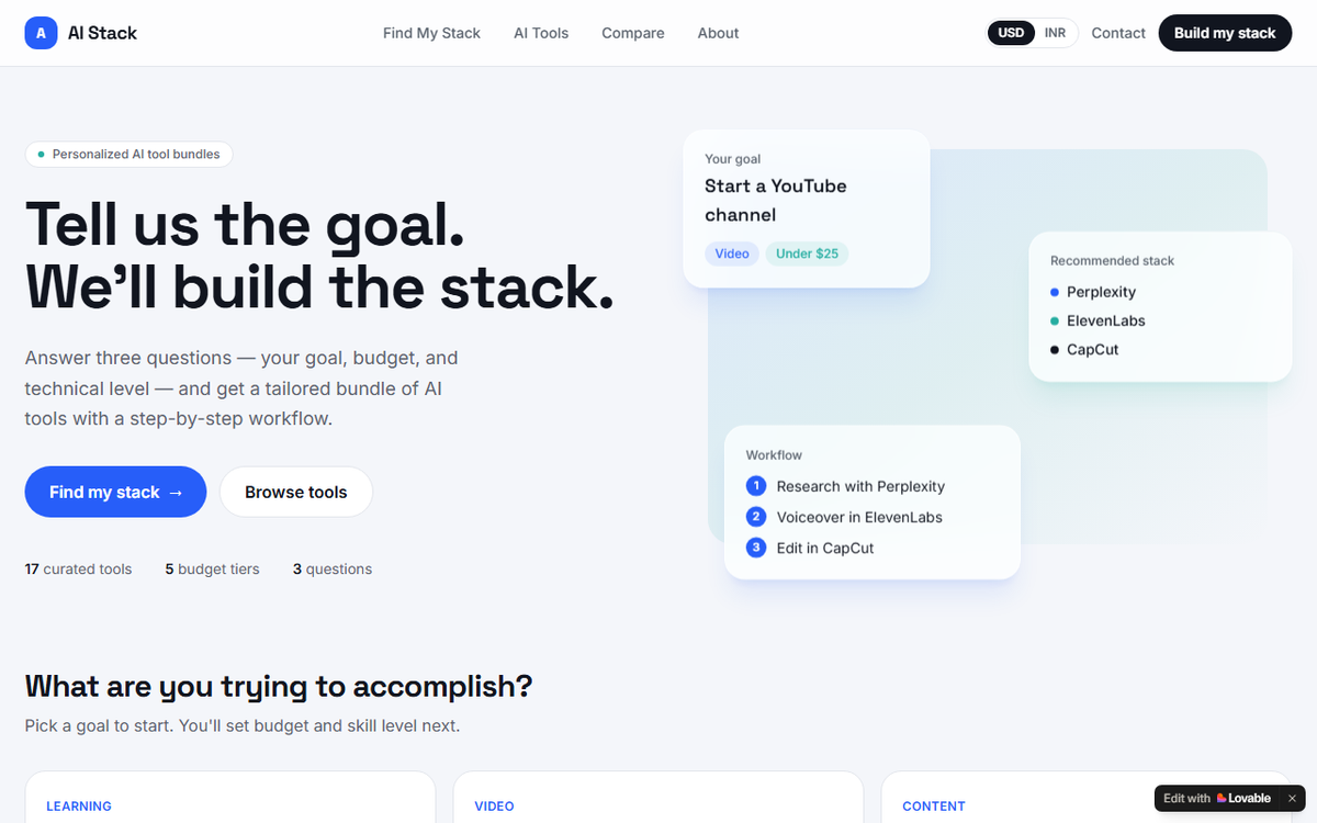
First impression
Lovable produced a polished, recognizably modern SaaS interface.
The core journey is easy to understand:
Goal → Budget → Technical level → AI Stack
The homepage is focused on the recommendation flow rather than overwhelming the user with a giant directory.
That focus is a real strength.
What the first-generation app did well
The Lovable audit found the major user journeys working end to end.
The three recommendation profiles produced different stacks.
SaaS + ₹500–₹2,000 + Developer
Perplexity → Claude → Replit → v0 → n8n
Displayed cost:
₹1,650/month
Setup:
~8 hours
Difficulty:
Advanced
YouTube + Free + Beginner
Perplexity → Claude → ElevenLabs → Descript → Canva
Displayed cost:
₹0/month
Setup:
~8 hours
Difficulty:
Beginner
Website + ₹2,000–₹5,000 + I don't code
ChatGPT → Claude → Canva → Gamma
Displayed cost:
₹3,050/month
Setup:
~6 hours
Difficulty:
No-code
The audit also found working search, filters, tool pages, comparison, navigation, contact validation, USD/INR switching and a functioning mobile menu.
That is a lot of application behavior for a single generation.
Where Lovable struggled
The recommendations weren't always semantically sensible.
For example, its no-code SaaS stack could omit a dedicated app-building tool even though Lovable itself was in the database.
The website stack could include Gamma, a presentation-oriented tool, as part of the website-building workflow.
The mobile homepage also had overlapping floating cards.
The contact form was another interesting case: it displayed a successful submission state, but the test found that the message was not actually sent or saved anywhere.
Lovable also reported that its tool prices were still marked “Not yet verified.”
One more caveat: after its audit, Lovable reported making a small fix after a blank-screen issue appeared on the stack-results page. That means the post-audit state should not be described as completely untouched.
Lovable score
| Category | Score |
|---|---|
| Visual design | 14/15 |
| Functionality | 23/25 |
| Prompt adherence | 13/15 |
| Recommendation logic | 12/15 |
| UX/navigation | 9/10 |
| Mobile | 8/10 |
| Content | 4/5 |
| Consistency | 4/5 |
| Total | 87/100 |
↔️ Scroll horizontally to see all columns
What stood out: a very complete first-generation product with unusually broad functionality, but recommendation semantics and a few trust/UX details still need work.
2. v0
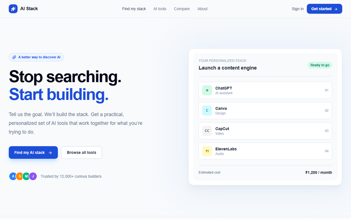
v0 was the biggest contrast in this experiment.
The interface can look polished, but the first-generation product was noticeably less complete than the others in the functionality we could verify.
What worked
The homepage loaded correctly.
The AI Stack branding and main call-to-action were present.
The recommendation wizard advanced through its initial path.
The directory supported search.
For the tested SaaS profile:
v0 → Lovable → ChatGPT → Gamma
with an estimated ₹1,200/month.
Where things broke down
The most significant issue was that several requested product areas were missing or unreachable.
The audit found:
- no discoverable Contact page
- a mobile hamburger that did not reveal a usable menu
- the “View details” action did not open a real detail page in the tested state
- advanced directory filters were not exposed
- comparison and contact testing could not be completed
There was also a questionable pricing presentation.
The SaaS recommendation showed ₹1,200 estimated monthly, while the listed tools were displayed as free in that result.
And the explanation under the tools was essentially a repeated template:
“fits your build a saas product”
rather than a tool-specific reason.
Another issue discovered in the audit was that the site used client-side state changes rather than normal anchor navigation for its main interactions, limiting ordinary deep-link behavior.
The recommendation engine also needed more testing. Only one full profile was completed in the self-audit, so we cannot honestly claim a complete three-profile comparison for v0 based only on that audit.
v0 score
| Category | Score |
|---|---|
| Visual design | 11/15 |
| Functionality | 12/25 |
| Prompt adherence | 9/15 |
| Recommendation logic | 7/15 |
| UX/navigation | 5/10 |
| Mobile | 5/10 |
| Content | 4/5 |
| Consistency | 3/5 |
| Total | 56/100 |
↔️ Scroll horizontally to see all columns
What stood out: v0 showed how easy it is for a generated interface to feel like a product before all the requested product surfaces are actually there.
3. Bolt.new
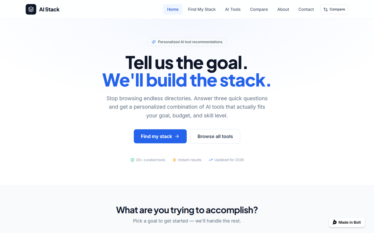
Bolt produced one of the most ambitious implementations in the test.
Its code-level audit showed a substantial application structure rather than a simple mockup.
Recommendation results
SaaS + Developer
ChatGPT → Claude → Lovable → Bolt.new → Make
YouTube + Free + Beginner
ChatGPT → Canva → ElevenLabs → CapCut → Suno
Website + No-code
ChatGPT → Lovable → NotebookLM → Claude → Gemini
The recommendation engine did produce different stacks for different goals and technical levels.
The directory implementation also included:
- search
- category filtering
- price filtering
- beginner filtering
- use-case filtering
- combinations
- clearing filters
Tool detail pages and comparison were implemented as well.
But there was a fascinating problem
The engine appeared to score tools first and map them to workflow steps afterward.
That created some strange assignments.
In the YouTube stack:
Canva → “Record & voiceover”
ElevenLabs → “Edit & caption”
CapCut → “Thumbnail & publish”
Those are not natural role assignments.
The tool list itself can make sense while the workflow labels are wrong.
There was another clear issue:
The prompt requested five workflow steps, but Bolt's goal plans contained only four step labels.
So the fifth tool ended up under:
Step 5
instead of a meaningful job.
Other implementation findings included identical icons for all goal cards, duplicate Compare navigation, non-clickable empty comparison slots, placeholder social links, a fictional-looking contact email, and potentially misleading aggregate “Free” cost labeling for freemium stacks.
Testing limitation
The Bolt report supplied for this article was a source-code/logic audit and explicitly said it did not have a browser tool for live screenshots or click-through testing.
So I would not claim that every one of these implementation findings was independently verified on the public website.
Bolt score
| Category | Score |
|---|---|
| Visual design | 14/15 |
| Functionality* | 22/25 |
| Prompt adherence | 12/15 |
| Recommendation logic | 11/15 |
| UX/navigation | 8/10 |
| Mobile* | 8/10 |
| Content | 4/5 |
| Consistency | 4/5 |
| Total | 83/100 |
↔️ Scroll horizontally to see all columns
*Based largely on implementation evidence rather than a full independent live-browser sweep.
What stood out: a broad, technically ambitious app whose interface and code structure were ahead of its recommendation semantics.
4. Replit
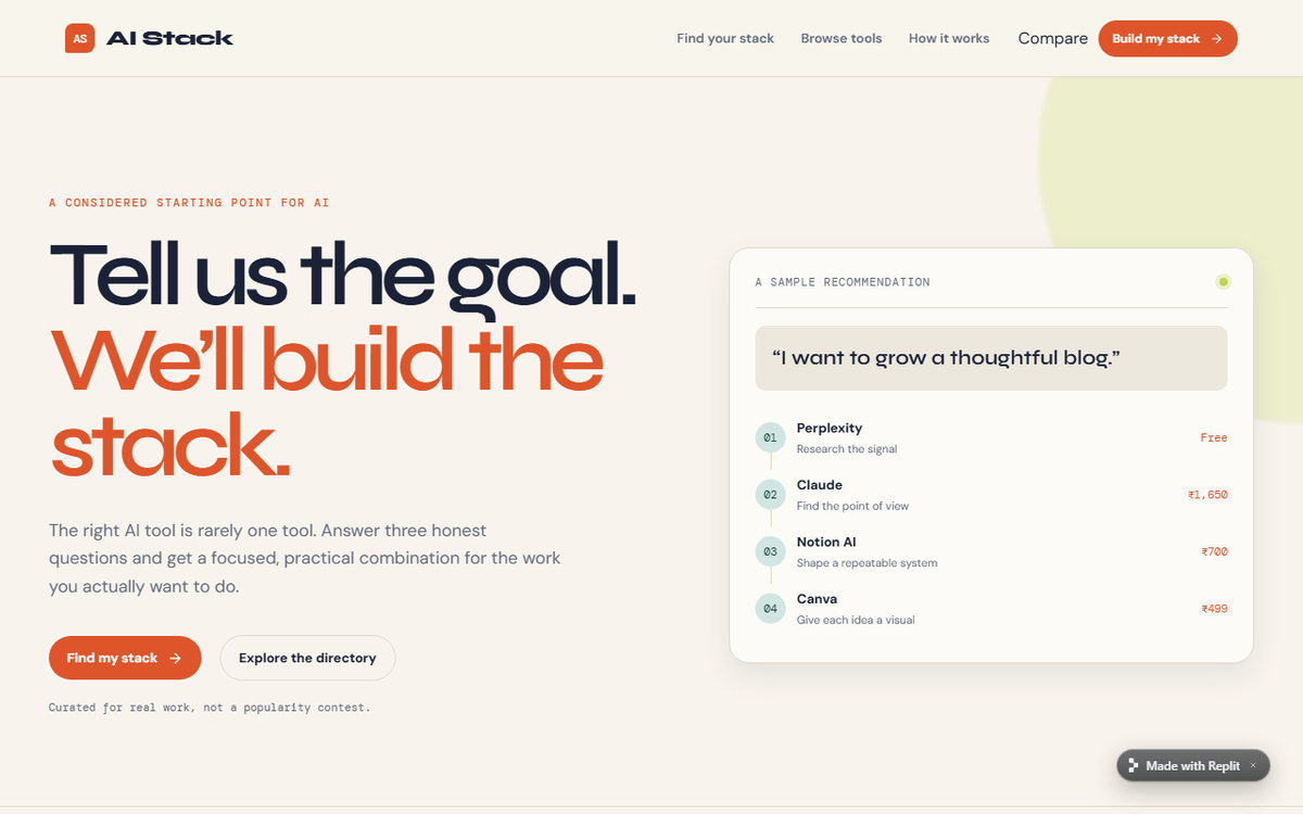
This was the most visually impressive result in the experiment based on the screenshots we captured.
It looked like someone had spent time polishing the product rather than simply filling a template.
The result page had clear hierarchy, useful stats, tool cards and a convincing workflow presentation.
But this was also where the experiment produced one of its best lessons:
a beautiful product can still have logic bugs underneath it.
Recommendation results
SaaS + ₹500–₹2,000 + Developer
The audit recorded:
Bolt.new → Replit → v0 → Claude
with an estimated ₹499–₹1,700 and a flexible/advanced-style workflow.
YouTube + Free + Beginner
ChatGPT → Canva → ElevenLabs → CapCut
Website + ₹2,000–₹5,000 + I don't code
Lovable → Canva → ChatGPT → v0
The goal generally changed the stack, but paid budget bands and more technical levels didn't always change the actual tool list.
The cost problem
One of the clearest findings was that the displayed estimated monthly cost did not reliably match the selected tools.
For one SaaS result, the listed tools had individual prices that added up to much more than the aggregate range shown by the interface.
The audit traced that to a hard-coded budget range rather than an actual sum of selected tools.
That is a serious trust issue for a recommendation product.
The mobile bug
At approximately 390 × 844, the results page expanded to 461px wide, creating horizontal scrolling.
That's a concrete, measurable mobile defect.
The contact-form problem
The form displayed a success state, but the audit found no network request or persistence behind the submission.
In other words:
the interface said the message was sent; the application did not actually send it.
Other issues
The audit also found:
- only four workflow steps shown despite the five-step brief
- a stale Compare count after removing an item
- default Replit metadata still in the page head
- directory search not covering all metadata
- budget and technical-level personalization weaker than the product implied
Replit score
| Category | Score |
|---|---|
| Visual design | 15/15 |
| Functionality | 21/25 |
| Prompt adherence | 13/15 |
| Recommendation logic | 10/15 |
| UX/navigation | 9/10 |
| Mobile | 7/10 |
| Content | 4/5 |
| Consistency | 3/5 |
| Total | 82/100 |
↔️ Scroll horizontally to see all columns
What stood out: the most polished visual result we saw, paired with several genuinely important implementation and recommendation issues.
5. Base44
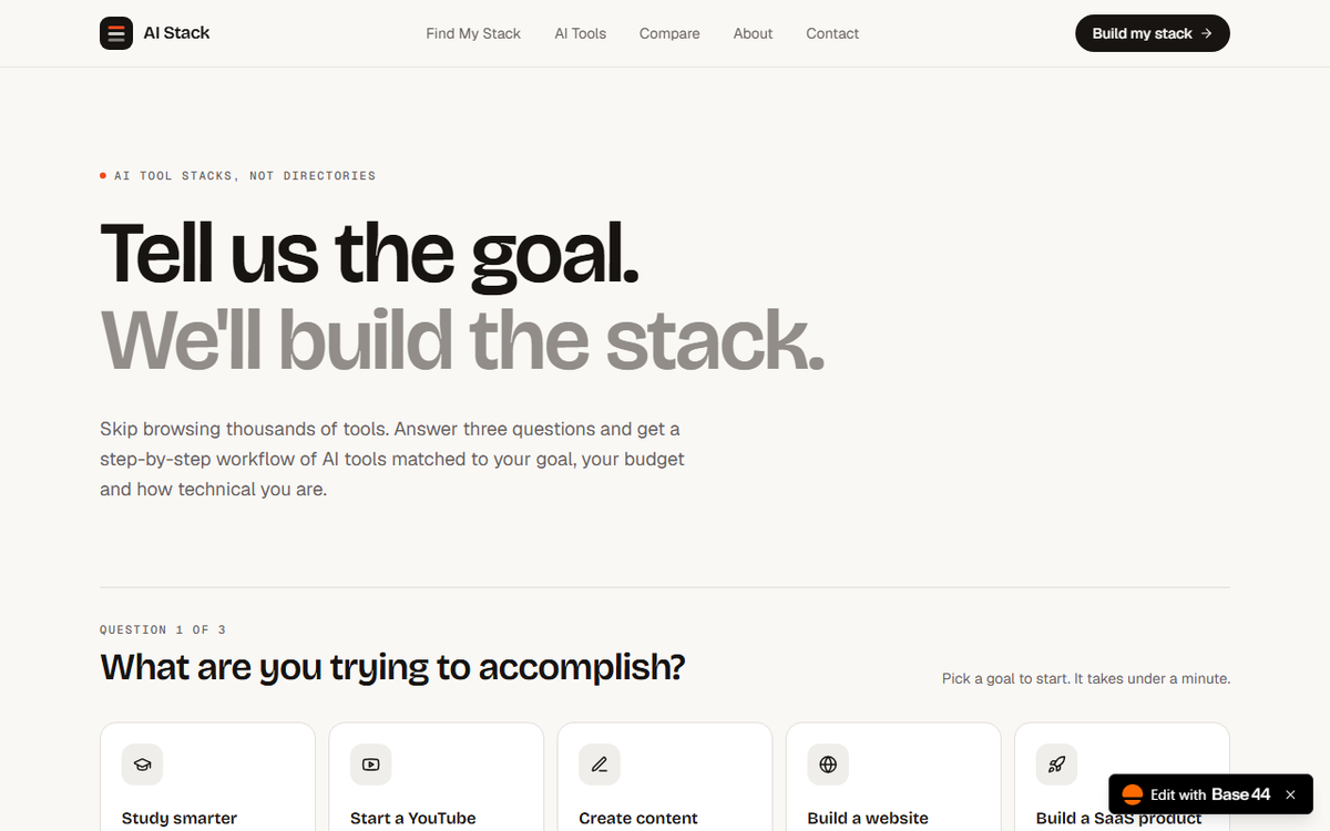
Base44 came surprisingly close to Replit in the overall polish of the result.
Its first-generation app also had a very complete product structure.
Recommendation results
SaaS + Developer
Perplexity Pro → Claude → v0 → Replit → Gamma
₹1,700/month · 57 min · Moderate
YouTube + Free + Beginner
Perplexity → ChatGPT → ElevenLabs → CapCut → Canva
₹0/month · 47 min · Easy
Website + ₹2,000–₹5,000 + No-code
ChatGPT Go → Framer → Canva → Grammarly → Perplexity
₹4,449/month · 70 min · Easy
One of Base44's strongest characteristics was that its recommendation engine genuinely used goal, budget and technical level as inputs in the implementation audit.
Directory
The code-level audit found all five requested filter types:
- category
- use case
- price
- free/paid
- beginner-friendly
It also supported combinations and clearing filters.
Search for writing returned relevant tools, while xyzabc123 produced an empty state.
Tool pages and compare
Tool details were comprehensive.
The compare system supported:
- adding tools
- removing tools
- replacing tools
- maximum three tools
- comparison persistence
- comparison table
The application also had recovery states for invalid routes, missing answers and nonexistent tools.
Where Base44 struggled
Its price filter had an important semantic problem.
The implementation used the first paid tier as the “starting price,” meaning a tool with a free usable plan could still be excluded from a low-price filter.
The search also didn't cover the full description field.
And the budget recommendation could be greedy.
In the SaaS profile, for example, it spent most of the user's ₹2,000 budget on Perplexity Pro while leaving ₹300 unused.
That is not necessarily a bug, but it shows the difference between:
budget-aware
and
budget-optimized
Testing limitation
The Base44 report was primarily a static/code audit. Its author explicitly said that live mobile rendering, browser Back/Forward and external-link HTTP checks still needed the Testing Agent.
So those areas should not be described as independently verified passes in the final article.
Base44 score
| Category | Score |
|---|---|
| Visual design | 14/15 |
| Functionality* | 22/25 |
| Prompt adherence | 14/15 |
| Recommendation logic | 14/15 |
| UX/navigation* | 9/10 |
| Mobile* | 8/10 |
| Content | 5/5 |
| Consistency | 5/5 |
| Total | 91/100 |
↔️ Scroll horizontally to see all columns
*Some categories rely on code-level evidence rather than a complete independent live-browser run.
What stood out: strong recommendation/data architecture, good cross-page consistency, and a surprisingly complete application generated from the same single brief.
The Results Side by Side
Here is the clearest way to look at the first-generation builds.
| Area | Lovable | v0 | Bolt.new | Replit | Base44 |
|---|---|---|---|---|---|
| Visual polish | Very strong | Good | Very strong | Excellent | Very strong |
| Recommendation flow | Strong | Limited/incomplete | Strong but semantic issues | Strong but inconsistent inputs | Strong |
| Directory | Strong | Limited | Strong | Strong | Strong |
| Filters | Strong | Limited | Strong | Strong | Strong |
| Tool details | Strong | Major limitation | Strong implementation | Strong | Strong |
| Compare | Strong | Limited/unverified | Strong implementation | Strong | Strong |
| Navigation | Strong | Major issues | Strong implementation | Strong | Strong |
| Contact | Validation works; persistence issue | Missing | Strong implementation | Fake success state | Validation works; persistence needs live confirmation |
| Mobile | Mostly good; homepage overlap | Mobile menu issue | Responsive implementation | Results overflow | Responsive implementation; live mobile not fully verified |
| Data consistency | Some pricing/label issues | Issues observed | Strong single-source implementation | Some cost inconsistencies | Strong single-source consistency |
↔️ Scroll horizontally to see all columns
The Three Recommendation Tests
This was one of the most revealing parts of the experiment because every builder was asked the same three scenarios.
Profile A
Build a SaaS product
Under ₹2,000/month
Developer
| Builder | Result |
|---|---|
| Lovable | Perplexity → Claude → Replit → v0 → n8n |
| v0 | v0 → Lovable → ChatGPT → Gamma* |
| Bolt.new | ChatGPT → Claude → Lovable → Bolt.new → Make |
| Replit | Bolt.new → Replit → v0 → Claude* |
| Base44 | Perplexity → Claude → v0 → Replit → Gamma |
↔️ Scroll horizontally to see all columns
*Where a self-audit did not complete all profiles, this row should be treated as the observed/available result rather than a complete three-profile measurement.
Profile B
Start a YouTube channel
Free
Beginner
| Builder | Result |
|---|---|
| Lovable | Perplexity → Claude → ElevenLabs → Descript → Canva |
| v0 | Not fully tested in the self-audit |
| Bolt.new | ChatGPT → Canva → ElevenLabs → CapCut → Suno |
| Replit | ChatGPT → Canva → ElevenLabs → CapCut |
| Base44 | Perplexity → ChatGPT → ElevenLabs → CapCut → Canva |
↔️ Scroll horizontally to see all columns
Profile C
Build a website
₹2,000–₹5,000
I don't code
| Builder | Result |
|---|---|
| Lovable | ChatGPT → Claude → Canva → Gamma |
| v0 | Not fully tested in the self-audit |
| Bolt.new | ChatGPT → Lovable → NotebookLM → Claude → Gemini |
| Replit | Lovable → Canva → ChatGPT → v0 |
| Base44 | ChatGPT Go → Framer → Canva → Grammarly → Perplexity |
↔️ Scroll horizontally to see all columns
The interesting part isn't simply that the stacks are different.
It's how intelligently the roles line up.
A stack can contain the “right kind” of tools while still attaching them to the wrong workflow steps.
What This Experiment Actually Taught Me
The easiest thing for an AI website builder to generate is a convincing homepage.
The hard part is everything behind it.
A static directory is easy to fake.
A search box is easy to draw.
A contact form is easy to style.
A “Compare” button is easy to place.
The difficult part is making those pieces behave correctly together.
That's why some of the most interesting findings in this experiment were not visual at all.
Lovable's contact form could report success without actually sending the message.
Replit's contact form had a similar problem.
Bolt's workflow could contain a correct-looking five-tool stack while attaching tools to semantically wrong steps.
Base44 could be budget-aware without necessarily optimizing how the budget was spent.
v0 could present a clean interface while missing several requested product surfaces.
The lesson is straightforward:
A generated website should be tested as an application, not judged as a screenshot.
So Which One Actually Built the Best Website?
There isn't one meaningful answer for every kind of user.
But the experiment does reveal some clear patterns.
Replit produced the strongest visual first impression
The screenshots made this the standout from a pure interface/design perspective.
The product looked polished, coherent and close to something you might expect from a real SaaS landing page.
But that polish was hiding meaningful logic and data problems, particularly around cost calculations, budget behavior, contact persistence and mobile overflow.
Base44 produced one of the strongest recommendation/data implementations
The recommendation engine responded to goal, budget and technical level, and the application used a shared data source across its major views.
Its weaknesses were subtler: price-filter semantics, search coverage and budget optimization.
Lovable produced one of the strongest end-to-end first generations
The live/browser audit gave us a lot of confidence that its core user journeys were actually functioning.
Its weaknesses were mostly around the quality and semantics of recommendations rather than missing major product surfaces.
Bolt built a broad and ambitious application
Its source audit showed a substantial implementation with many of the requested features.
But its workflow-role assignment logic needs more intelligence than simply ranking tools and slotting them into steps.
v0 was the least complete first-generation product in this particular test
It demonstrated a polished starting point but left several explicit requirements missing or unreachable in the tested state.
That doesn't mean v0 is incapable of building them.
It means this exact one-prompt run did not produce them reliably enough for this experiment.
The Biggest Surprise
Before running the experiment, it would have been easy to assume the builder with the prettiest result would also have the strongest application.
That wasn't what happened.
The experiment repeatedly showed a gap between:
“This looks finished.”
and
“This is finished.”
That gap is probably the most useful thing to know before using any AI website builder.
Should You Build a Real Website With One Prompt?
Yes — but treat the first generation as a starting point.
A good AI builder can get you dramatically closer to a working product than starting from an empty editor.
But before you publish a real business application, test:
- every important button
- search
- filters
- forms
- navigation
- mobile layouts
- external links
- error states
- pricing calculations
- authentication, if applicable
- SEO metadata
- accessibility
- performance
- security
And most importantly:
Don't trust the success message. Test the action behind it.
Free Plans and the Cost of Experimenting
The builders also differ significantly in how they meter free usage.
As of the current official pricing pages:
Lovable offers a Free plan with 5 build credits per day, capped at 30 per month, plus monthly Cloud credits. citeturn307747search2
v0 has a Free plan with $5 in monthly credits and 7 messages per day.
Bolt.new provides 300,000 tokens per day and 1 million tokens per month on Free, along with hosting and Bolt branding. citeturn307747search1
Replit offers a free Starter plan, while Core is currently $20/month or $18/month billed annually. citeturn307747search5turn307747search8
Base44 offers Free with 25 message credits and 100 integration credits per month. citeturn307747search0
These aren't directly comparable units, so the useful question is not:
“Which company gives the biggest number?”
It is:
“How much useful work can I get done before I hit the limit?”
Affiliate Opportunities
This experiment also revealed a natural affiliate angle for TechAffiliate.
Lovable currently advertises an affiliate program with up to $100 for each first-time subscriber referred. citeturn307747search4
Base44 currently advertises $100 for referrals that convert to paid users within a month, with a 30-day cookie window and a $300 payout threshold. citeturn307747search3
For an article like this, affiliate links should appear only where they genuinely help the reader.
The article should never call a tool “better” because it pays a commission.
The testing comes first.
The monetization comes second.
Final Take
AI website builders have crossed an important threshold.
You no longer need to know how to write every line of a web application before you can get a serious prototype on screen.
But this experiment also made something very clear:
Generating a website is becoming easy. Verifying a website is still work.
Five builders received the same prompt, and all five produced something recognizable.
All five could create a polished-looking product.
But they made different assumptions.
Some were stronger visually.
Some were stronger structurally.
Some were better at carrying the user's inputs through the recommendation system.
Some looked finished while still leaving important interactions incomplete.
That's why I wouldn't judge an AI website builder from its first screenshot.
Open the site.
Click the buttons.
Change the inputs.
Try the search.
Submit the form.
Open it on your phone.
Then decide whether the result is actually useful.
The first generation is the demo. The behavior is the review.
FAQ
Can AI website builders really build a website from one prompt?
Yes. In this experiment, all five produced a working website/application prototype from the same natural-language brief. The quality and completeness of the resulting functionality differed.
Which AI website builder produced the best-looking result?
In this particular experiment, Replit produced the strongest visual first impression based on the screenshots we captured. That does not mean its generated application had the fewest technical issues.
Which AI website builder had the strongest recommendation logic?
Base44 showed the clearest evidence that goal, budget and technical level could all influence the generated stack in the implementation audit. Other builders also changed recommendations, but with different limitations.
Are free plans enough for a test like this?
Yes, although the limits vary. Free plans are sufficient for an initial experiment, but a complex multi-page project can consume a meaningful portion of the available usage.
Is a one-prompt website ready for production?
Not automatically. You should independently test functionality, mobile behavior, SEO, accessibility, security, forms, links and content before publishing a production site.
Should I choose an AI website builder based on appearance?
Appearance matters, but it shouldn't be the only criterion. A polished interface can contain broken or simulated functionality.
Methodology and Limitations
This article deliberately combines different evidence types:
Direct first-generation screenshots and live-site observations where available.
Browser-based QA performed on parts of the experiment.
Builder self-audits from Lovable, Replit, and Base44.
Source-code/logic audits for Bolt and Base44 where live browser testing was not available in the supplied audit environment.
The distinction matters.
A code-level finding such as:
“the comparison limit is enforced in the implementation”
does not mean we independently clicked it in a live browser.
Likewise, a builder's self-audit is not the same thing as an independent audit.
Where a test could not be fully completed, this article says so.
The websites were generated from the same prompt, but the underlying AI systems are probabilistic and can produce different results between runs.
Sources
Official product/pricing sources
- Lovable Pricing: https://lovable.dev/pricing
- v0 Pricing: https://v0.app/pricing
- Bolt.new Pricing: https://bolt.new/pricing
- Replit Pricing: https://replit.com/pricing
- Base44 Pricing: https://base44.com/pricing
Affiliate sources
- Lovable Affiliate Program: https://lovable.dev/partners/affiliates
- Base44 Affiliate Program: https://base44.com/affiliates
Test websites
- Lovable: https://findaistack.lovable.app/
- v0: https://ai-stack-gold.vercel.app/
- Bolt.new: https://ai-stack-recommendat-7v45.bolt.host/
- Replit: https://ai-stack--techaffiliate.replit.app/
- Base44: https://ai-stack-techaffiliate.base44.app/
SEO Metadata
SEO Title:
I Gave 5 AI Website Builders the Same Prompt — Here’s What They Built
Alternative SEO Title:
I Tested 5 AI Website Builders With the Same Prompt: Replit vs Lovable vs Bolt vs v0 vs Base44
Meta Description:
I gave Lovable, v0, Bolt.new, Replit, and Base44 the same website prompt and tested what they actually built, including design and functionality.
URL Slug:
ai-website-builders-same-prompt-test
Primary Keyword:
AI website builders comparison
Secondary Keywords:
- best AI website builder
- AI website builder comparison
- build a website with AI
- AI website generator
- AI website builder from prompt
- Lovable vs v0
- Lovable vs Bolt
- Replit AI website builder
- Base44 website builder
Suggested H1:
I Gave 5 AI Website Builders the Same Prompt. Here’s What They Actually Built
Suggested Featured Image:
A realistic editorial-style collage showing five generated SaaS interfaces side by side, with a bold central phrase: “Same Prompt. Five AI Builders.”
Featured Image Alt Text:
Five AI website builders compared after receiving the same website prompt
Editorial Checklist Before Publishing
- [ ] Replace any remaining product URLs with final tracking/affiliate URLs where approved.
- [ ] Re-check current pricing immediately before publishing.
- [ ] Add screenshots from the actual five first-generation websites.
- [ ] Clearly label screenshots by builder.
- [ ] Keep the original prompt in the article.
- [ ] Do not change any generated site before capturing the screenshots used as evidence.
- [ ] Update any result that changes between the testing date and publication.
- [ ] Keep the affiliate disclosure visible.
- [ ] Add internal links to relevant TechAffiliate articles.
- [ ] Verify that every factual pricing/affiliate statement still matches the official source.
Affiliate Disclosure
TechAffiliate may earn a commission if you purchase through our links. This helps support our work but does not influence our reviews. We always provide honest assessments of all products.
Related Articles
 AI & Machine Learning
Jul 1, 2026 • 21 min read
LongCat-2.0 Explained: Meituan's 1.6T Open-Weight AI Model Targeting GPT-5.5 and Claude
LongCat-2.0 is Meituan's 1.6T open-weight MoE AI model with a 1M context window and agentic coding focus. What's confirmed, claimed, and unverified.
 AI & Machine Learning
Dec 30, 2025 • 16 min read
DeepSeek vs ChatGPT vs Gemini 2026: Which AI is Better? (Tested 30 Days)
Gemini topped India's AI searches in 2025. I tested GPT-5.2, Gemini 3 Flash, and DeepSeek V3.2 for 30 days. Real results, privacy warnings, honest winner.
 Tech News
Dec 19, 2025 • 4 min read
India Just Beat USA: 65 Million Daily ChatGPT Users - How Free AI Made India #1 Global Market
India now has 65 million daily ChatGPT users—more than double the USA's 31 million. A massive 607% growth makes India the world's largest AI market. Free platforms, ₹150/month data, and 700M mobile users fueled this revolution. Full breakdown inside.
Comments (0)
Leave a Comment
No comments yet
Be the first to share your thoughts!